New Logo Updates: What’s Changing and How It Affects You
Every time a company rolls out a fresh logo, people start talking. Some love the sleek look, others miss the old design. In this post we break down why brands switch up their marks, showcase a few recent examples, and give you simple steps to make a logo change work for your business.
Why Brands Choose a New Logo
First off, it’s not just about looking cool. A new logo often signals a bigger shift – maybe a merger, a move into new markets, or a desire to shake off a dated image. Companies also use a redesign to connect with younger audiences who expect modern, minimalist graphics. When a brand’s values evolve, the visual identity should follow so the message stays clear.
Take the example of a South African bank that recently updated its emblem to a bolder, blue‑green symbol. The change wasn’t random; the bank wanted to highlight its digital‑first strategy and show confidence in sustainable finance. The fresh look helped the bank appear more innovative without overhauling its entire brand promise.
How a New Logo Impacts Customers
Customers notice two things first: the visual shift and what the shift means for them. A well‑executed logo refresh can boost trust, especially when the brand backs it up with better service or new products. On the flip side, a poorly explained redesign can cause confusion – think of a logo that disappears from signage overnight with no announcement.
Research from a local marketing firm showed that 68 % of shoppers form an opinion about a brand within the first three seconds of seeing its logo. That’s why clarity and consistency matter. If you’re rolling out a new logo, make sure every touchpoint – website, social media, invoices, uniforms – reflects the change at the same time.
Here are three quick actions to keep the transition smooth:
- Announce early. Use a short video or blog post to explain why the change matters.
- Show the evolution. A side‑by‑side comparison helps fans see the continuity.
- Update everywhere. From email signatures to storefront signs, avoid mixed branding.
Even small businesses can benefit from these steps. If you’re a local café thinking about a new sign, start by posting the story on your Instagram, then replace the old sign the same week. Consistency will keep regulars feeling comfortable while attracting new faces.
Finally, remember that a logo is just one piece of the brand puzzle. The voice, colors, and customer experience all need to align with the fresh mark. When they do, a new logo becomes a catalyst for growth rather than a distraction.
Stay tuned to our tag page for more updates on logo launches, design trends, and real‑world case studies. Whether you’re a brand manager or a curious reader, the next big logo change is just a click away.
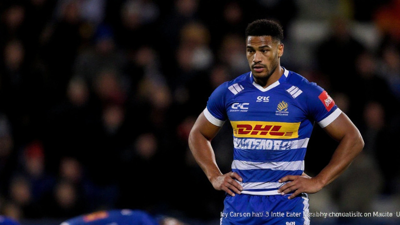
Stormers Rebrand: New Logo, Fresh Identity and ‘In It Together’ Mantra
Cape Town’s DHL Stormers have rolled out a full rebrand that includes a brand‑new logo and the tagline “In It Together.” The design keeps the classic blue‑white hoops but adds interlocking rings and a subtle lightning bolt shaped like the stadium. CEO Johan le Roux says the change is about more than looks – it’s a statement of unity for players, fans and local schools. The update replaces a 25‑year‑old emblem and aims to connect the club with a diverse supporter base. The new look is already sparking conversation across South African rugby.

